
how to mix patterns in your home
Fall is at our doorsteps (theoretically at least) which means cozy and layered fabrics are knocking on the front door of my brain. And although pattern isn't exclusive to fall, I'm ready to wrap myself in fall color palettes that nicely complement some classic patterns. And by that I mean I could bury myself under a mountain of blankets as I find a way to watch Practical Magic 2 from my sofa (despite how not cold it is). I thought it would be worthwhile to talk about how to mix patterns in our homes. So just in case you also want a beautifully coordinated blanket mountain to swallow you up, let's talk about mixing patterns.

The time is near to bring out the blankets, bulkier bedding, and anything that encourages you to curl up and linger longer. Can't you hear the bed above whisper, "I know you want to be in fetal position. Just indulge for a minute?"
There's something about mixing patterns that can be so casual, nonpretentious, and inviting. Not too precious. So how do we achieve that without it feeling overwhelming or stuffy? I'm sure most of us can think of somewhere that has a lot of pattern that isn't quite relaxing. Here's my take on good pattern mixing, informed by my background in design and psychology.
Psychology tells us we can get overwhelmed when it's difficult to scan a space and not to able to identify threats. So when it's more obvious to see the beginning and end of a single object, it's less anxiety producing. Although illusions can pique curiosity, having clear boundaries or containers it's something many opt for when desiring a comfortable space they're in regularly.
You may have heard the trick of corralling multiple small objects together on top of a tray for it to feel less cluttered. It simplifies what gets processed in our brain as a single larger object instead of multiple smaller pieces. This is a similar principle of using visual cues to our advantage. All of the following suggestions are to better increase the scan-ability of our spaces and make it more obvious where our attention needs to be to get that sense of safety and comfort quickly.
1- variety in scale
The first place to start is to figure out the size of the patterns you're working with. Are they relatively small, medium, or large? If there's one patterned piece you're anchoring everything else around, build the other patterns around it with different scales. Let's take the below bedroom as an example.
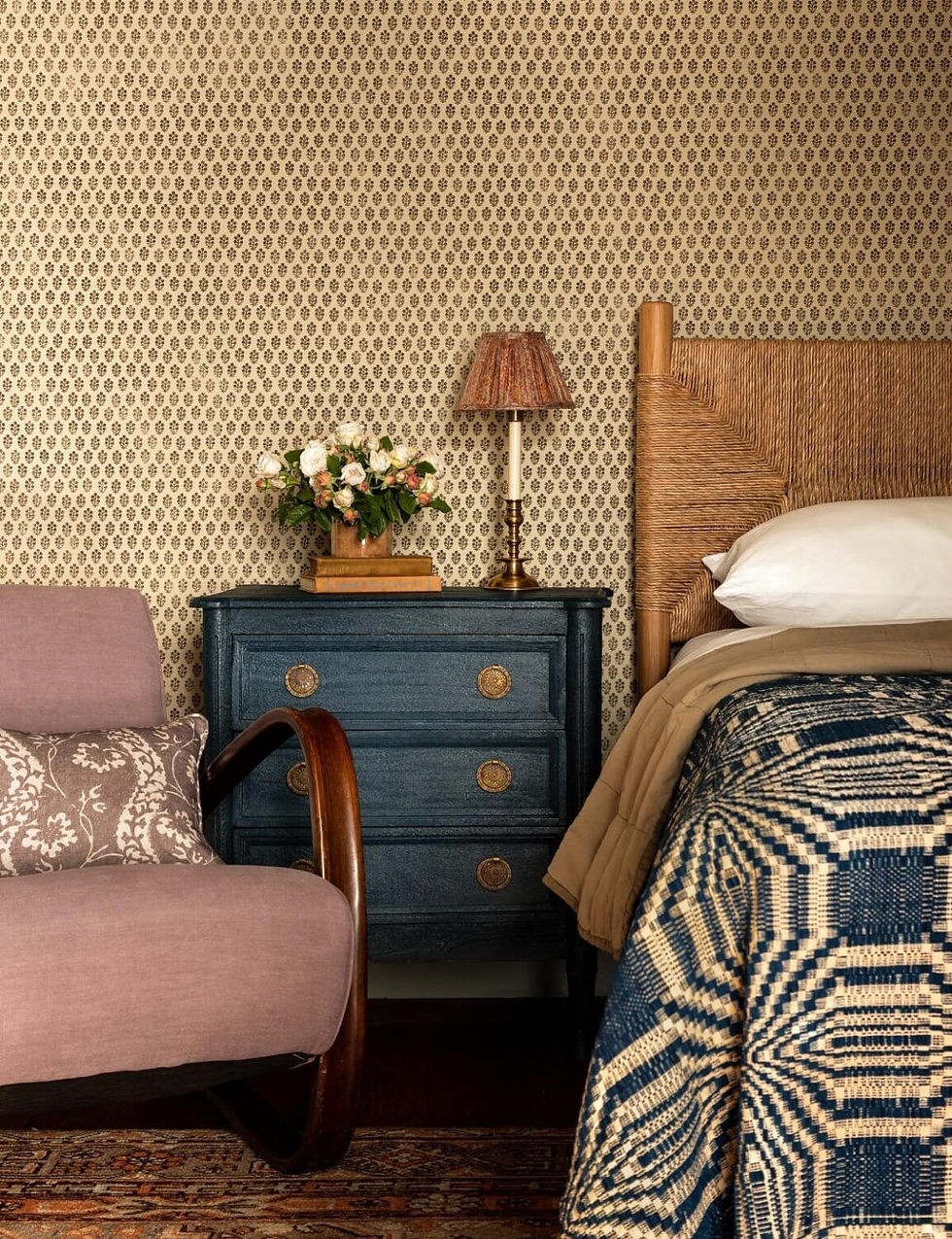
We have three main patterns in this picture: the bedding, the pillow on the chair, and the wallpaper. This example very clearly shows the different size or scale of the patterns. If we were to take a square foot of each and put them next to each other, we could easily identify which pattern is repeating the most often (the wallpaper) which signals that it's the smallest pattern. And we perhaps would not be able to tell the bedding even repeats itself at all, telling us it's the largest. The more distinct the repeatability between patterns are within a room, the more successful the mixing is.
Generally, if you think about a square foot I would categorize them like this:
small: repeats many times (10+)
medium: repeats a handful of times (~4)
large: doesn't repeat/fits once
If we want to get fancy, anything significantly smaller than what I'm identifying as 'small' will often be processed in the brain more as texture than a pattern (depending on eyesight and how close one is to the pattern). Some people would still consider this a pattern, I don't care too much one way or another, the concept remains the same. For anything significantly larger than the 'large', we can call that extra large. That would still be considered a pattern and again, same concept applies here too, move between different sizes of pattern. If all the patterns are too close to each other in scale, this is where overwhelm can start to rear its head.
If you're looking online, it's important to not just go off of a swatch as they can be deceiving. Find a picture that shows the scale, have them send you a physical sample, or look to see if the specifications can give you an idea of how large the pattern is. The larger the pattern, the more important it is to make sure the context is being fully considered, specifically with wallpaper. More on that at the end of the article where I add a note about wallpaper.
2- don't be too fussy with colors
Color and contrast are other indicators that help us identify items visually. That being said, if your 'color palette' is strictly two colors, your brain is likely going to get flustered when introducing multiple patterns. If you're absolutely adament about your narrow color palette, then I highly encourage you to at least add tints, tones, or shades of your colors to give your eye some grace. Variety in color separates objects from one another and gives the contrast needed for that to swiftly identify things individually. It's also difficult to find multiple patterns that are in a tight and uniform color palette. Those small deviations will make the space feel relaxed.
If you aren't married to a color palette, that may make your job easier! If you find a piece of art, fabric, or anything else with pattern and color to it, you can pull the palette from that anchor piece.
3- assortment of patterns
When selecting the types of patterns you want in a space, it's good to have a diverse range here as well. If you like straight lines, maybe stripes, plaids, or checkers will suit your pattern needs. The first image shared from Merchant & Mills does a great job making a cohesive and cozy bed with various stripes, plaids, and a gingham. I'd identify this as staying in the same 'pattern zone' since they're all unified by their straight lines and classic patterns we're all familiar with. However there's floral patterns, animal prints, abstract designs, polka dots, and many others to consider (here's a decent list). We'll explore how to mix different pattern zones and use another image to explore that.

This bed set up has straight lines (bedspread), a couple nontraditional patterns (headboard and accent pillow), and a floral (blanket). Here are the three general categories I think of for pattern zones:
linear (exclusively features straight lines)
floral (anything that includes flowers, leaves, or botanicals)
fluid (animal prints, abstract, anything that doesn't fit above)
The headboard and accent pillow could be argued as linear since they both have relatively straight lines. And if we want to lean into that line of thinking, then we're working with the first two pattern zones of linear and floral.
In this scenario, I think they used the floral in a very strategic spot. It breaks up what would otherwise be two similar patterns touching, the bedspread and accent pillow. Since the scale of those two items are similar and they share the color black, having those two touching would clash a bit. There wouldn't be a line as distinct for our eye to determine the edges between the two. The orange in the pillow would be doing most of the heavy lifting. But with the introduction of the floral, that creates a nice buffer area to further define these as separate. The plain sleeping pillows are also assisting with a similar idea between the accent pillow and headboard, which will be covered more in depth in the next section.
However, the headboard and accent pillow I'd actually say are in the fluid pattern zone since they're nontraditional. For my brain, this would hit all three pattern zones. If you're also on board with this definition, then this bed does an excellent job of fulfilling all the zones. This is why it feels interesting and stimulating, not necessarily bogging the brain with information overload. It's distinct yet contained.
4- consider the surface area
This one may sound obvious, but the more space with pattern, the bigger the impact it will have. So if you're just starting to be keen on the idea of adding pattern to your space, wallpapering your entire room might be a shock to the system. However, when deciding to have multiple patterns, I think it's important to go beyond just reserving pattern for the pillows on your couch. It's a little too... flat. It's all in the same place, taking up a similar amount of space, used for the same function, and is pretty uniform. We want to encourage the eye to move around the room and not get stuck in one spot.
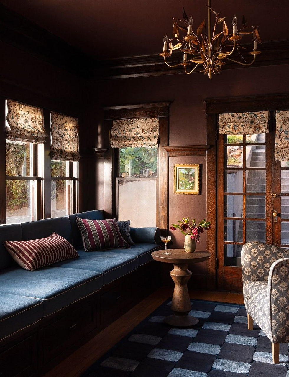
In this design we can see that yes, we have multiple patterns happening in pillow form on the left. But our eye is also drawn upwards to the window coverings, downwards to the rug, and to the right with the chair. There's plenty of different areas for your eye to bounce around for little delights. This sitting room has a great balance of all of the different points I've brought up in this article.
There's also a lot of surface area in this picture that doesn't contain pattern. The negative space allows for our eyes and minds to have natural resting points. This creates for a moment of relaxation while contrasting and enhancing the patterns. The combination allows us to appreciate the patterns without feeling overwhelmed. If your space is too boring, add more pattern or interest. If your space is too swamped, bring in more simplicity with negative space or reducing items.
None of the examples I'm sharing today are full on maximalist vibes where everything is covered in pattern. Some of them have plainly painted walls or an element of solid colored bedding. This is important to support the pattern that's in the space. I think because pattern can be perceived as strong, it's not intuitive to think about 'supporting' it. This is where patterns can go wrong. It doesn't feel cohesive when we rely on them to do nearly everything in the space without intentionally designing with them. A pattern shouldn't just be thrown into a room willy nilly. Finding ways to balance pattern rather than have one be the clear star of the room is what I like to aim for.
A related but seperate point...
A note about wallpaper:
Although I've been primarily focusing on fabrics and upholstery, I do want to say something important about wallpaper. When considering the pattern's scale, it's important to reference the context of where you're placing wallpaper. It's important with all of design but there's special variables that wouldn't apply to a duvet cover or object. How large is the room? Are there a lot of windows or openings that would interrupt how the pattern repeats? For example, in the Blossom Project, we used a pattern that was extra large for the wallpaper. It's definitely a show stopper and I'm not unhappy with the way it turned out. But, with the multiple windows, sliding doors, and thicker molding around the openings, there isn't as much opportunity to see the pretty florals since they're so large. A smaller pattern for the wallpaper would have absolutely given a different feeling to the room and could have been better for the overall design.
It would be fair to point out that not the shared images hit every point I've laid out in this article, but they're still successful! Design is part art and part science. I tend to highlight the science-y parts via psychology. What I don't share often is that my own mother disagrees with many of the points I bring up. This is because there is a huge element of design that is personal preference and is uniquely influenced by our own experiences.
So no, none of these are hard and fast rules but, they are what I'm keeping in mind when I approach a pattern filled design. If you want to incorporate all of them, fan-freaking-tastic! However, I think picking two recommendations on this list to focus on, will get you a long way. I'd strongly recommend at least incorporating the first point!
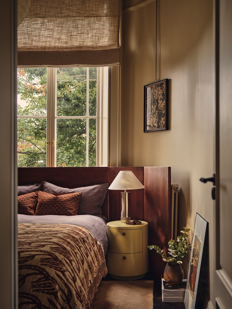
Despite if you're struggling with letting go of the warmer weather, I hope this entices you with a cozy way to cope with the disappearing daylight.
Good mixing of pattern is all about variety and contrast. This applies to the size of pattern, color, types patterns or 'pattern zones', and where or how much surface area they're applied to. You want to support the pattern in the space, not make them fight for all of the attention. This is how pattern doesn't feel only like a crutch to add interest but considered to strengthen the overall design.
There are no affiliate links in this article. The links provided are only to give credit to the various example images that I pulled to visually communicate ideas.


Comments